Look-Dev Exploration
- Shannon Taylor
- May 23, 2025
- 3 min read

Updated: May 27, 2025
Pre-production for Graveyard Gremlins begins in fall 2025, but I'm excited to start thinking about different methods of texturing 3D assets in a 2D style. I'd like to have a better idea of what approaches we could implement before we officially start. If I can help the future process be more smooth and efficient for the team, I'm happy to do extra work in the beginning.
Bifrost Paint Effect
Something I've been wanting to look into is a painterly rendering style using Arnold. My first step was quickly modeling a stone pillar from the initial concept designs to test on.
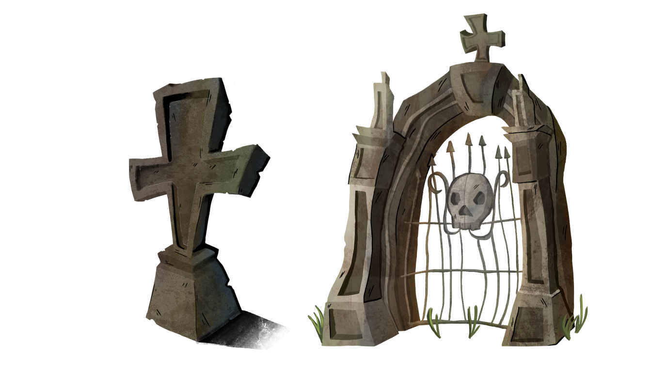
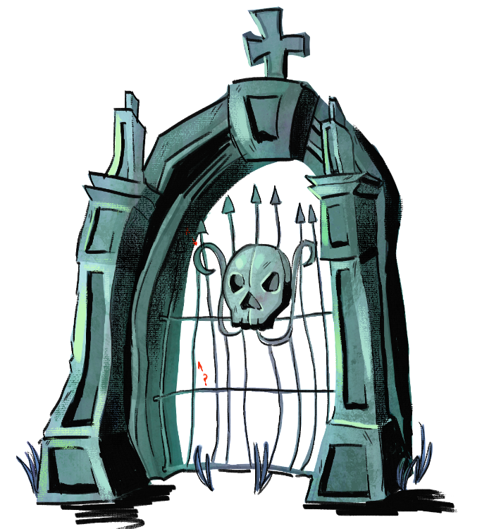
Concept by Tanya Style development by Seromi

Another thing I've been curious about is Bifrost, and this gave me a perfect opportunity to learn it.
I found a tutorial to use as a starting point, getting a feel for the general workflow. For what I'm using it for, the process is similar to the hypershade or node editor, making it relatively easy to pick up.
To get a paint stroke effect, I first made an alpha in photoshop to plug into the opacity node of an aiStandard surface which shaded the Bifrost scatter points.
I started out with a good base, but wasn't happy with the uniform scale and rotation of the paint strokes. My solution was the randomize_point_scale and randomize_point_rotation nodes.


Brush stroke alpha, paint shader, Bifrost graph

Before I did more with the placement, size, and rotation of the paint strokes, I wanted to see if I could add color variation.
I set up an aiRampRgb and selected 5 cohesive hues, with the intention of every paint stroke having its own color.
The ramp out color connected to the input node of an aiColorJitter, where I adjusted the minimum and maximum hue values to get a variety. Then I changed the color jitter type to "object" to ensure each brush stroke was only one color.


Now having color variation, I found that the color ramp was not working how I originally intended, which let to more experimentation and learning about Arnold's other color node options.
The nodes I went with were aiUtility, AiComposite, and aiColorCorrect. I was able to adjust an approximate range of hues by selecting initial colors and multiplying them by blue values.


With a better understanding of the color functionality, I adjusted the color nodes until I got something I was happy with.
In the scatter points node, I lowered the size range for the brush strokes, and increased the scatter amount from 2,000 to 5,000. I also unchecked "prioritize normal" under the orientation section.
The result was better, but most of the shape was lost. I wanted to preserve that detail, so I selected some key faces and duplicated them. I used substance painter to draw messy outlines around the edges, and set up an opacity map so only the lines were visible. The added lines brought back the shape language in the pilar while also adding to the painted look.


Overall, I think there is charm to this technique, but I think it will look better on more organic assets. for the sake of 3D environment for Graveyard Gremlins, I'd like to try this again on plants.
Comments